Flowing Data pointed me to a particularly cool interactive map that shows the world's current and planned submarine cables. The blog collects data visualization of just about everything from serious to simply fun.
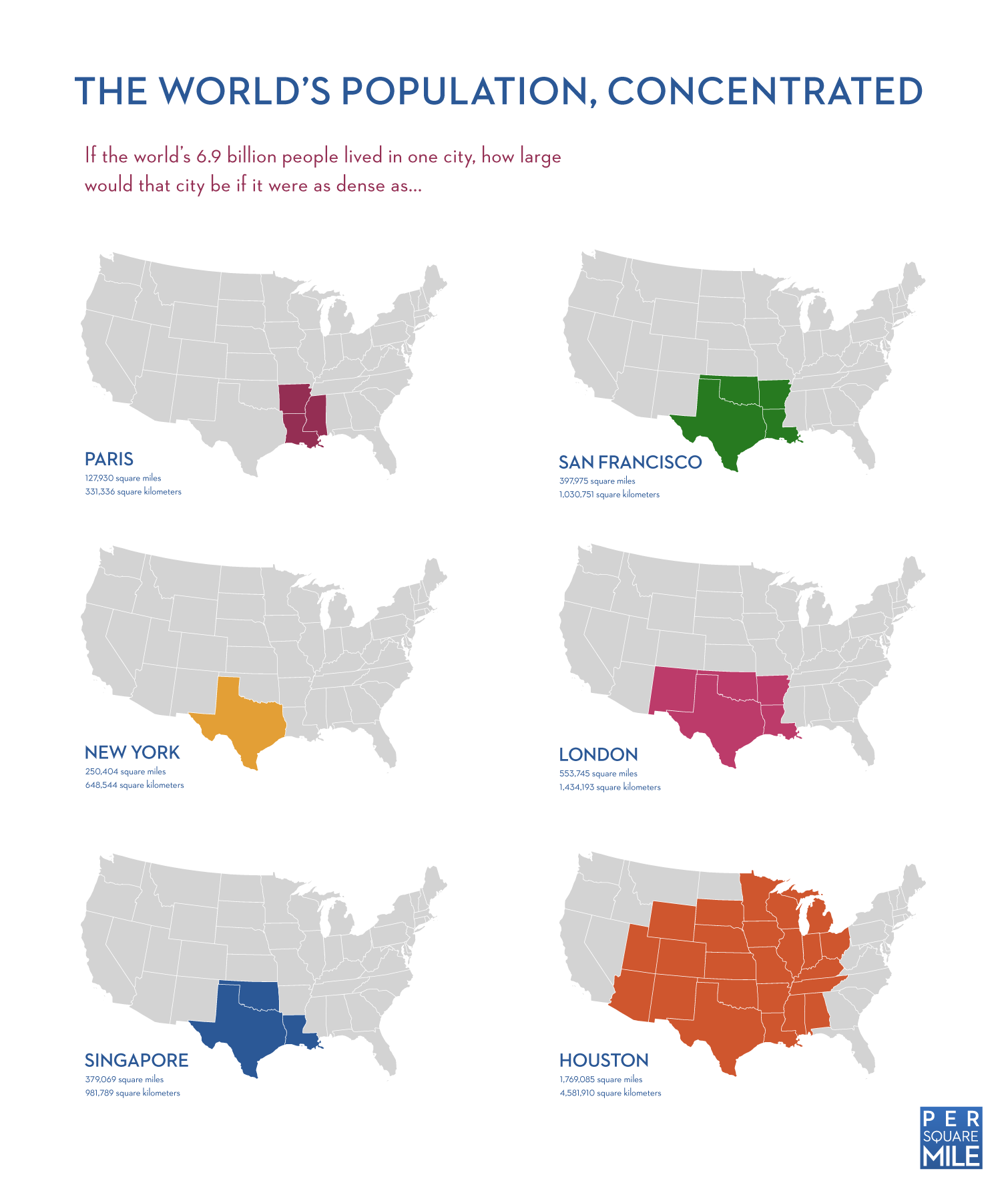
But my favorite one has to be this: a map that shows how large a city would be if the entire population of the world lived in it - by density of different cities.
There's also a book: Visualize This: The FlowingData Guide to Design, Visualization, and Statistics

No comments:
Post a Comment